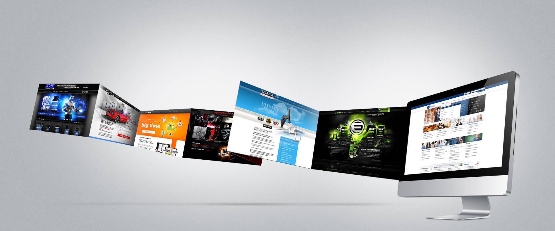
With technological advancements happening every day, website designs can never be static. You may have gotten a state-of-the-art website designed for your brand a decade ago but that may be completely obsolete today. With time, you need to update your website design regularly to create a better, more evolved experience for your audience. While creating a new website or refurbishing your old one, you need to make sure that it is dynamic and engaging. Dynamic web design is created using the latest tools with knowledge and precision. Website design company exist for this very reason, to bring your brand story to life or to bring out a story for you if you don’t have one yet.
Some elements, when incorporated thoughtfully, help tell stories and explain your brand to your visitors. Some help to improve how content looks on a specific device. While it may not be necessary to include every trend you see online, many of them can have the potential to improve your visitor’s experience.
Here are a few elements in dynamic website design that you must ensure are present on your website
A Strong, Subtle Colour Palette
This might sound rudimentary but colour schemes and usage are a crucial part of modern web design. A strong colour palette helps create cohesiveness between everything your business puts out. Brands that have both primary and secondary colours get more wiggle room to work with when creating new elements for your website, be it the homepage, landing pages, blogs or a resource database. However, too many colours can be visually distracting, so most modern website designs opt for only two or three colours at most in their major design elements.
Unique, Common And Large Typography
Brands prefer one font across their services or product range. This helps visitors easily identify them among the competitors. According to a study done by the NNGroup, on average, people spend about 10 seconds on a web page before bouncing. This makes it important for you to be able to communicate your value proposition within the stipulated time to retain their attention for a few more minutes. Large, easy-to-read fonts help you tackle this issue. You also need to make sure your font is compatible across multiple devices.
Chatbots or Virtual Assistants
One of the most dynamic ways you can make your visitors feel welcome on your website is with a virtual assistant. Chatbots are a powerful way to engage with your customers who take the time to visit your website. When customers visit your site, they either have a question or need help with a problem. You can link your chatbot to an answering service and book appointments, process sales, or troubleshoot issues any time of the day. With this feature, you let your customers know that you are there for them, ready to attend to their most pertinent concerns.
Easy Navigation
When you start to design your website, you need to remember that navigation is key, it is essentially the map that displays the core places your customers can visit. There is nothing people dislike more than a disorganised or confusing website interface. The key is to ensure that your visitors can easily find what they are looking for. You can include a hamburger menu or a navbar with streamlined content. The design should also be responsive so that it doesn’t glitch while being used on a mobile phone.
Embedded Videos
Videos can add a lot to a page. They can be used to tell a story and significantly reduce the amount of other content needed to explain your business. Potential customers can understand the key points about you and your brand without having to read a single line of text. In addition to this, a video is processed a lot faster by the human mind compared to text. Videos appear effortless and can be consumed very quickly, adding to your brand’s credibility.
Strategic Call-To-Action Buttons
Web development services in Delhi and across India stress the importance of the right call to action or CTA button, as this is directly aligned with your business objective. Websites are meant to connect you with people who are interested in your brand. Once this connection is made, these visitors expect you to retain some type of relationship with them. CTAs like email subscription forms, free downloadable ebooks, free product forms, online consultations, etc. work well in your favour. In modern dynamic website design, you strategically place such CTAs that can help you gather information about your visitors, their email address in the least, so that you can continue conversations with them as leads and convert them into customers.
With a rise in social media platforms and usage, brands and businesses often underestimate the power and importance of a well-designed website. The professional digital marketing company offers you a lot more customisation options and allows you to create more unique experiences for your customers in line with what your brand stands for.

